September 2026 - Orvador

Best Fundraising Software for Nonprofits (2026): Compared by Team Size & Budget

Most best fundraising software lists rank tools the same way for every nonprofit reading them. A solo development coordinator running her first Giving Tuesday campaign gets the same recommendation as a 40-person team managing a $12M budget across three regions.

The right platform depends on three things: your team size, your budget, and increasingly, your country’s donor ecosystem. An Indian nonprofit collecting UPI donations and issuing 80G donation certificate has different needs than a US nonprofit running recurring credit card gifts, and most “best of” lists only cover the second. This guide covers both.

Indian nonprofits should look at DanaMojo for owned donation infrastructure with built-in 80G and FCRA handling, or Ketto/ImpactGuru/Milaap for campaign-based crowdfunding. Globally, solo fundraisers should start with fee-free platforms like Zeffy or Givebutter. Small teams with a modest budget fit Donorbox or Givebutter Plus. Growing teams need donor retention tools like Bloomerang. Mid-size nonprofits juggling multiple revenue streams fit Neon CRM or DonorPerfect. Large, complex organisations are usually the only ones who need Blackbaud Raiser’s Edge NXT.

Why Best Depends on Your Team and Your Country Instead of the Feature List
Best Depends on Your Team and Your Country

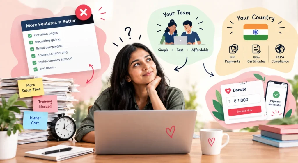
Software review sites tend to rank fundraising platforms by feature count, and that’s backwards for most nonprofits. A tool with more features usually means more setup time, more training, and more monthly cost, none of which help a two-person team that just needs a clean donation page live by Friday.

It also matters where your donors actually are. A platform built around US card payments and IRS receipting doesn’t handle UPI, 80G certificates, or FCRA requirements for foreign contributions well, if at all. That’s why Indian nonprofits usually end up choosing from a different shortlist entirely, not because the global tools are worse, but because they’re solving a different problem.

Best Fundraising Platforms for Indian Nonprofits
Best Fundraising Platforms for Indian

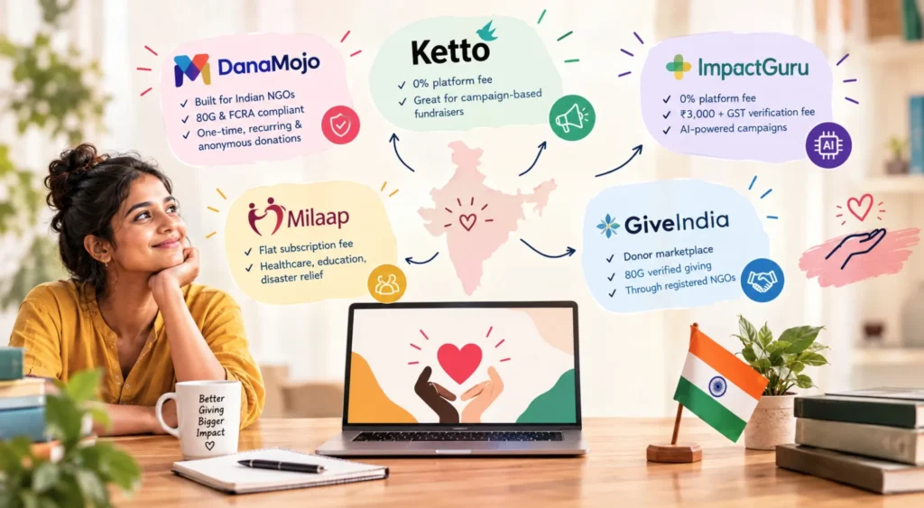
DanaMojo is built specifically as donation infrastructure for Indian NGOs rather than a crowdfunding marketplace. It handles one-time, recurring, and anonymous donations, and is built around the compliance details Indian nonprofits actually deal with: 80G receipting and FCRA-compliant handling of foreign contributions. Pricing isn’t published as a flat rate; DanaMojo scopes a plan based on your organisation’s size and donation volume, so budget for a sales conversation rather than a self-serve signup.

Ketto is one of India’s oldest crowdfunding platforms, running largely on a 0% platform fee model funded by optional donor tips, with payment gateway and verification costs still applying on top. It’s strongest for time-bound, story-driven campaigns, medical fundraisers, disaster relief, education drives, rather than as an everyday donation page for your own website.

ImpactGuru runs a similar 0% platform fee structure, plus a flat due-diligence and verification fee (roughly ₹3,000 + GST per campaign) for identity and document checks. It leans hard into AI-assisted campaign building and offers international donor support, which makes it a reasonable fit for Indian NGOs trying to reach diaspora donors abroad.

Milaap started as rural and micro-entrepreneur funding before expanding into healthcare, education, and disaster relief campaigns. It charges a flat subscription-style fee rather than the pure tip-funded model Ketto and ImpactGuru use, worth comparing directly against your expected campaign size.

GiveIndia works differently from the four above; it’s a donor marketplace rather than a campaign builder, and it’s particularly useful when donors specifically want 80G-verified giving through a registered NGO rather than an individual crowdfunding page.

The honest trade-off across all five: crowdfunding platforms like Ketto, ImpactGuru, and Milaap are built for campaign-based, time-bound asks with a network effect. DanaMojo is built for an NGO that wants owned, ongoing donation infrastructure on its own website. Most established Indian nonprofits end up running both: a crowdfunding platform for campaigns, DanaMojo or a similar gateway for the year-round donate button.

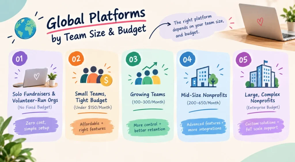
Global Platforms by Team Size & Budget
DanaMojo is built specifically as donation infrastructure for Indian NGOs rather than a crowdfunding marketplace. It handles one-time, recurring, and anonymous donations, and is built around the compliance details Indian nonprofits actually deal with: 80G receipting and FCRA-compliant handling of foreign contributions. Pricing isn't published as a flat rate; DanaMojo scopes a plan based on your organisation's size and donation volume, so budget for a sales conversation rather than a self-serve signup. Ketto is one of India's oldest crowdfunding platforms, running largely on a 0% platform fee model funded by optional donor tips, with payment gateway and verification costs still applying on top. It's strongest for time-bound, story-driven campaigns, medical fundraisers, disaster relief, education drives, rather than as an everyday donation page for your own website. ImpactGuru runs a similar 0% platform fee structure, plus a flat due-diligence and verification fee (roughly ₹3,000 + GST per campaign) for identity and document checks. It leans hard into AI-assisted campaign building and offers international donor support, which makes it a reasonable fit for Indian NGOs trying to reach diaspora donors abroad. Milaap started as rural and micro-entrepreneur funding before expanding into healthcare, education, and disaster relief campaigns. It charges a flat subscription-style fee rather than the pure tip-funded model Ketto and ImpactGuru use, worth comparing directly against your expected campaign size. GiveIndia works differently from the four above; it's a donor marketplace rather than a campaign builder, and it's particularly useful when donors specifically want 80G-verified giving through a registered NGO rather than an individual crowdfunding page. The honest trade-off across all five: crowdfunding platforms like Ketto, ImpactGuru, and Milaap are built for campaign-based, time-bound asks with a network effect. DanaMojo is built for an NGO that wants owned, ongoing donation infrastructure on its own website. Most established Indian nonprofits end up running both: a crowdfunding platform for campaigns, DanaMojo or a similar gateway for the year-round donate button. Global Platforms by Team Size & Budget

For nonprofits outside India, or Indian nonprofits with a significant international donor base, the right platform is mostly a function of team size and budget.

Solo Fundraisers & Volunteer-Run Orgs (No Fixed Budget)

If you’re running fundraising alone, or your team is a rotating group of volunteers, the priority is zero fixed cost and a setup you can manage without training.

Zeffy charges nothing, funded entirely through optional donor tips at checkout, meaning your organisation keeps 100% of the donation if the giver chooses to cover the platform’s cost. It handles donation forms, ticketing, and basic memberships, covering most of what a small org needs in year one.

Givebutter’s free plan works the same way, tip-funded with no platform fee when tips are enabled, and a flat 3% fee if you turn tipping off. It adds peer-to-peer fundraising and event pages on the free tier, which Zeffy doesn’t match as strongly.

For this group, the CRM depth that dominates the rest of this list doesn’t matter yet. A clean donation form that doesn’t cost anything upfront is the whole job.

Small Teams, Tight Budget (Under $150/Month)

Donorbox runs on a tiered model. The Standard plan is free with a roughly 2.95% platform fee on transactions. The Pro plan runs about $150 a month with a lower 1.75% fee, worth it once volume is high enough that fee savings outweigh the fixed cost.

Givebutter Plus sits in a similar range, running roughly $29 to $35 a month depending on contact volume, and adds CRM automations and advanced reporting the free tier lacks.

Little Green Light starts at $45 a month for up to 2,500 records and scales to around $90 a month at 20,000 records. It’s not a fundraising page builder first, it’s a donor management system, which makes it a strong pairing if you’re already using a separate tool for donation pages.

For nonprofits trying to decide when a donor management system is actually necessary, see our guide to donor databases and donor management.

Growing Teams With a Dedicated Development Function (100–300/Month)

Bloomerang is built around donor retention, with engagement scoring and constituent timelines that flag which donors are drifting before they lapse. Pricing runs modularly: the core CRM starts around $125 a month, the fundraising add-on around $40 a month, and volunteer management around $119 a month.

MonkeyPod’s Essentials plan runs about $167 a month and bundles fundraising, CRM, and fund accounting into one system, useful for smaller finance teams who don’t want to reconcile numbers across three tools.

Neon CRM’s Essentials tier starts around $99 a month and is worth a specific look if your organisation runs on memberships as well as donations.

Mid-Size Nonprofits With Multiple Revenue Streams (200–650/Month)

DonorPerfect runs three tiers, roughly $99, $199, and $649 a month, priced by record count with add-on modules layered on top. Strong for established development shops that need granular reporting across campaigns.

Neon CRM’s Impact and Empower tiers (roughly $209 and $409 a month) scale with revenue and add automation and deeper integrations as you move up.

MonkeyPod’s Pro plan, around $292 a month, extends Essentials with more advanced accounting for organisations managing restricted funds or multiple program budgets.

Large, Complex Nonprofits (Enterprise Budget)

Blackbaud Raiser’s Edge NXT is the long-standing enterprise standard, at roughly $4,000 annually to start for around 1,000 records, scaling from there. Powerful, but with a steep learning curve, only worth it with dedicated ops staff.

GoFundMe Pro (formerly Classy) and CharityEngine both move to custom, quote-based pricing at this tier, built for large peer-to-peer campaigns or complex, multi-entity structures.

Weak vs. Strong Software Decisions

Three common choices, and what separates the ones that hold up from the ones that quietly cost you.

Example 1 – Choosing by feature list

Weaker

Picking the platform with the most total features, regardless of team size.

Stronger

Picking the platform that matches your current headcount, then reevaluating once the team grows.

Why it wins: A two-person team paying for enterprise-grade automation ends up using roughly a third of what they're paying for, while the unused complexity slows down the parts they do use.

Example 2 – Evaluating platform fees

Weaker

Choosing the platform with the lowest advertised fee.

Stronger

Calculating total cost at your actual donation volume, including gateway, verification, and compliance fees, before comparing sticker prices.

Why it wins: A ‘0% platform fee’ Indian crowdfunding campaign can still lose 2 to 5% to payment gateway and verification charges. The advertised number and the actual cost are frequently two different figures.

Example 3 – Matching platform type to purpose

Weaker

Using a crowdfunding platform as your only, permanent donation page.

Stronger

Pairing a campaign platform for time-bound asks with owned donation infrastructure for everyday giving.

Why it wins: Crowdfunding platforms are built for urgency and story-driven sharing, not for a donor quietly giving monthly for three years. Using the wrong tool for the wrong ask costs conversions either way.

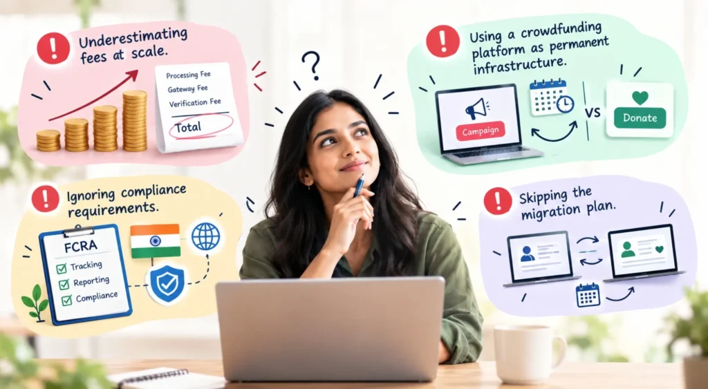
Common Mistakes Nonprofits Make When Choosing Fundraising Software
Common Mistakes Nonprofits
Underestimating fees at scale A platform that looks cheapest at low volume can become the most expensive option once donation numbers grow.
Using a crowdfunding platform as permanent infrastructure Campaign platforms are built for bursts, not for a donate button that needs to work quietly, every day, for years.
Ignoring compliance requirements Indian NGOs handling foreign contributions need FCRA-compliant tracking; skipping this at the software stage creates real problems later.
Skipping the migration plan Moving donor history and recurring gift schedules between systems needs a real timeline, not a weekend project before a launch.

Not Sure Which Platform Fits Your Organisation?

Picking the right platform is only half the equation, getting donors to find your donation page in the first place is the other half. That’s where SEO for nonprofits comes in: organic search is often the channel bringing in donors who’ve never heard of you before they searched. See how Orvador’s SEO for Nonprofits service and NGO digital marketing services work together to turn that traffic into donors your new platform can actually convert.
Get in Touch With Our Team

Get in touch with our team

SEO Keywords for Nonprofits: How to Find Terms That Attract Donors & Supporters

Most nonprofit websites rank for the wrong things. They show up for their organization’s name and not much else, while the searches that actually lead to a donation, a volunteer sign-up, or a grant application go to somebody else’s site entirely.

That’s usually a keyword problem, not a content problem. The team wrote the blog, built the program page, and published the impact report. But nobody checked whether real people search for those exact terms, or whether the phrasing matches how a donor actually thinks when they type into Google.
Search engine optimization for nonprofits isn’t the same exercise as ecommerce keyword research, because the conversion you’re chasing (a donation, a volunteer application, a grant inquiry) has different intent behind it than a product purchase. This guide breaks down the keyword types your nonprofit actually needs, a practical process for finding them, and where to put them once you have the list.

Why Do Nonprofit Keyword Research Work Differently?

Nonprofit Keyword Research Work

Most SEO advice is written for ecommerce brands, and a lot of it doesn’t transfer cleanly to a nonprofit.
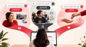
An ecommerce shopper searching ‘waterproof hiking boots men’ is close to a purchase. They know what they want, and they’re comparing options. A person searching ‘how to help refugees in [city]’ isn’t ready to donate yet. They’re still working out whether the problem is real, whether it affects them, and whether your organisation is the one to trust with their money or time.

That gap matters because it changes what ranking well even means for a nonprofit:

A donation-page keyword needs to convert immediately, because the searcher already knows they want to give.

An awareness-stage keyword needs to earn trust first. Ranking for it and then hitting the reader with a donate button in the first line usually backfires.

A volunteer or program keyword sits somewhere in between. The searcher wants to help, but they’re still figuring out how.

If your keyword list treats all three the same way, either as pure ‘donate now’ terms or pure informational terms, you’ll either scare off top-of-funnel readers or fail to capture people who are ready to act. The fix is building out all three layers deliberately, which is what the rest of this guide covers.

The Five Keyword Types Every Nonprofit Needs

Five Keyword Types

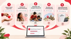
Before opening a keyword tool, it helps to know what categories you’re actually filling in. Most nonprofit SEO strategies fall apart because they only ever chase one of these five, usually the cause-awareness type, while leaving the highest-converting ones untouched.

1. Donor-intent keywords

These are searches from someone close to giving. Think ‘donate to [cause] India,’ ‘best NGO for [cause],’ ‘child education charity near me.’ Low volume individually, but the searcher is warm. These belong on your donation page and homepage, not buried in a blog post three clicks deep.

2. Cause and mission keywords

Broader, awareness-stage searches tied to the problem you solve: ‘child malnutrition India statistics,’ ‘why is ocean plastic a problem,’ ‘girls education gap causes.’ These bring in top-of-funnel traffic and are where most of your blog content should live.

3. Volunteer and program keywords

Searches from people who want to get hands-on: ‘volunteer teaching opportunities [city],’ ‘NGO internship for students’, ‘how to volunteer at an animal shelter.’ These convert differently than donor keywords, so they need their own landing pages.

4. Branded and local keywords

Your organisation’s name, plus name + location or name + program combinations: ‘[NGO name] reviews,’ ‘[NGO name] Bangalore,’ ‘[NGO name] annual report.’ These are usually easy wins because there’s little competition, but they only bring in people who already know you exist.

5. Informational and adjacent keywords

Terms your audience searches that aren’t directly about your cause but sit next to it: ‘80G tax exemption India,’ ‘CSR partner NGO checklist,’ ‘how to choose a charity to donate to.’ These pull in donors, corporate partners, and grant officers who are further along in their research than a pure awareness search suggests.

Most nonprofit sites we’ve audited are overweighted on category two and almost empty on categories one and three, which explains a lot of the traffic-without-donations problem.

How to Actually Find These Keywords?

How to Actually Find These Keywords

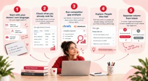
Once you know the categories, the research process is mostly about filling each bucket with real search terms, not guesses.

Step 1: Start with your donors’ own language, not your organization’s

Pull actual phrases from donor emails, volunteer applications, and social comments. Nonprofits often write in program language (‘early childhood development intervention’) while donors search in plain language (‘help kids learn to read’). The gap between those two phrasings is where most missed keywords live.

Step 2: Check what you already rank for

Google Search Console shows every query that’s already bringing you impressions, including ones you never targeted on purpose. Sort by impressions with low click-through rate. That list is often full of terms you’re already halfway ranking for, and a small content or title tweak can push them onto page one. Google’s Search Console Performance report lets you review queries, impressions, clicks, CTR, and pages shown for specific searches. Google Search Console Performance report

Step 3: Run competitor gap analysis

Tools like Ahrefs or Semrush let you plug in two or three comparable NGOs and see what they rank for that you don’t. This is faster than building a keyword list from scratch, and it surfaces terms you’d never think to search for on your own.

Step 4: Explore ‘People Also Ask’

Search your core terms on Google and pull every question in the ‘People Also Ask’ box. These are near-verbatim searches, and they map directly onto FAQ sections and blog subheadings. AnswerThePublic keyword research guide does the same thing at scale and groups the questions by intent, which saves you the manual sorting.

Step 5: Separate volume from intent

A keyword with 50 searches a month and clear donor intent is worth more than one with 5,000 searches and vague intent. Nonprofit search volumes are almost always lower than ecommerce or SaaS categories, so don’t discard a term just because the tool shows a small number. Ask what the person searching it actually wants, then decide if it fits your funnel.

Weak vs. Strong Keyword Targeting: What Actually Works

Weak vs. Strong Keyword Targeting

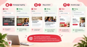
Seeing the difference in practice makes this concrete faster than more theory does.

Example 1 – Homepage targeting

Weaker: Targeting ‘nonprofit organisation’ as the primary homepage keyword.

Stronger: Targeting ‘child education NGO in Mumbai’ or ‘NGO for girls education India.’

Why it wins: The generic version has enormous competition and zero specificity, so Google has no signal about who should actually see your page. The specific version matches exactly how someone searches when they already have a cause and a location in mind, which is a far more common search pattern than the generic version.

Example 2 – Blog content

Weaker: A blog post titled ‘The Importance of Education’ targeting nothing in particular.

Stronger: A blog post titled ‘Why Girls Drop Out of School in Rural India (And What Actually Helps)’ targeting the keyword ‘girls education dropout rate India.’

Why it wins: The stronger version answers a question someone is actually typing into Google, with a title that mirrors the search. The weaker version might be well-written, but it isn’t built around anything searchable, so it has no path to organic traffic regardless of quality.

Example 3 – Donation page

Weaker: A donation page optimised only for ‘[Organisation name] donate.’

Stronger: The same page also optimised for ‘donate to child hunger relief India’ and ‘monthly giving program for education NGO.’

Why it wins: Branded-only targeting caps your ceiling at people who already know you. Adding cause-based, donor-intent phrasing opens the page to people actively searching for a place to give who haven’t heard of your organisation yet, which is a much larger pool.

The pattern across all three: match the phrase to how a real person searches, not to how your organization describes itself internally.

Where to Actually Place These Keywords

Finding the keywords is half the job. Most of the impact comes from placing them correctly.

Donation and campaign pages should carry donor-intent keywords in the H1, the first paragraph, and the meta title. This is the highest-value real estate on the site.

Program and ‘get involved’ pages should carry volunteer and program keywords, separated by program type rather than lumped into one generic page.

Blog content should carry cause and informational keywords, one primary keyword per post, with internal links pointing back to the relevant donation or program page.

About and impact pages are a natural home for branded and local keywords, plus the informational terms corporate partners and grant officers search.

A common mistake is stuffing every keyword type onto the homepage and leaving every other page untargeted. Split the categories across the pages actually built to convert that specific intent.

For a broader framework, see Orvador’s guide to SEO for nonprofits, which covers how nonprofit SEO connects visibility with donors, volunteers, and supporters.

Common Mistakes Nonprofits Make With SEO Keywords

Common Mistakes Nonprofits

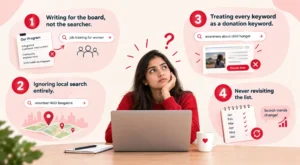
Writing for the board, not the searcher. Program names and internal jargon rarely match search behaviour. If your team calls it ‘integrated livelihood intervention’ and donors search ‘job training for women,’ the donor’s phrase wins every time.

Ignoring local search entirely. Even national and international NGOs get meaningful traffic from city-level searches (‘volunteer NGO Bangalore,’ ‘donate old clothes Delhi’), and most nonprofit sites have no pages built to catch them. Orvador also covers this in its earlier guide to local SEO for nonprofits.

Treating every keyword as a donation keyword. Slapping a ‘Donate Now’ CTA onto a page targeting an awareness-stage search usually raises bounce rate instead of donations.

Never revisiting the list. Search behaviour shifts with news cycles, disaster response periods, and tax season. A keyword list built once and never updated goes stale within a year.

Not sure which of these keyword types your nonprofit is missing?

Our team can run a quick audit of your current rankings and show you exactly where the gaps are. Get in touch with our team

Getting the keyword list right is the starting point. Turning it into pages that actually rank and convert is where most nonprofits get stuck. If you’d rather have someone build and run this system for you, take a look at how Orvador’s SEO for Nonprofits service handles the full loop, from keyword research through to donation-page optimisation.

Canva for Nonprofits: Get Canva Pro Free Today + 12 Ready-to-Use Templates

Nonprofits often need to create social graphics, fundraising campaigns, event materials, donor communications, and impact reports without a dedicated design team. Canva for Nonprofits gives eligible organizations access to Canva's premium tools at no cost, making it easier for small teams to create consistent branded content.

That gap can make an organization look less professional and potentially weaken the impact of its fundraising materials. Why? Because people give to organizations that look like they know what they're doing. Canva for Nonprofits closes that gap for free, and most eligible organizations still haven't applied for it. This guide walks through who qualifies, exactly how to apply, and twelve templates worth building the day your account gets approved.

Quick Answer: Is Canva Free for Nonprofits?

Yes. Canva offers eligible registered nonprofits, NGO's, and qualifying social impact groups access to Canva Pro's premium features and team collaboration tools for one team of up to 50 users for free. If you want more seats, it's possible to obtain them at 50% off the cost of Canva Enterprise. Eligibility is at Canva's discretion and subject to country restrictions. Registered 501(c)(3) nonprofits (and equivalent charities internationally) can apply for Canva for Nonprofits and get Canva Pro's full toolkit free for a team of up to 50 people. Apply directly through Canva's nonprofit page with your IRS determination letter or local equivalent. Canva says it will generally update applicants within 72 hours once the application is submitted, although some verification cases may take longer. Once you're in, start with the twelve templates below rather than trying to build your whole brand kit in one sitting.

Is Your Nonprofit Eligible for Canva for Nonprofits?

Canva's eligibility bar is narrower than ‘we do good work,’ so it's worth checking before you spend time on the application. Canva is explicit that meeting the basic criteria doesn't guarantee approval. Applications are reviewed at Canva's discretion, so treat this as a grant you're applying for.

Likely eligible:

  • Registered 501(c)(3) organisations in the US, including public charities with an educational, religious, scientific, or charitable mission
  • Registered charities or nonprofit-equivalent entities in other countries where Canva runs the program (Registered nonprofit organizations in countries where Canva Nonprofits is available can apply, but eligibility and documentation requirements vary by country, with country-specific documentation rules)
  • Organisations that are independent of government and not operating for commercial profit

Not eligible:

  • 501(c)(4) or 501(c)(6) organisations, meaning advocacy groups, business leagues, and trade associations
  • Schools, colleges, and universities
  • Government bodies and political organisations
  • Individuals, freelancers, and for-profit businesses, even if they support charitable causes
Canva Nonprofits: Are You Eligible?

How to Apply for Canva for Nonprofits: Step-by-Step Guide

Once approved, the grant covers a team of up to 50 people with no monthly cost, for as long as your organisation stays eligible. If your team eventually outgrows 50 seats, Canva offers additional seats at 50% off Canva Enterprise. rather than forcing you back to full price.

Now let’s look at the steps

  1. Step 1Set up your Canva account on your organisation's domain

    If you already have a personal Canva account, it's worth creating a fresh one tied to your organization's email address before applying. It keeps the account cleanly owned by the org rather than by whoever happened to sign up first.

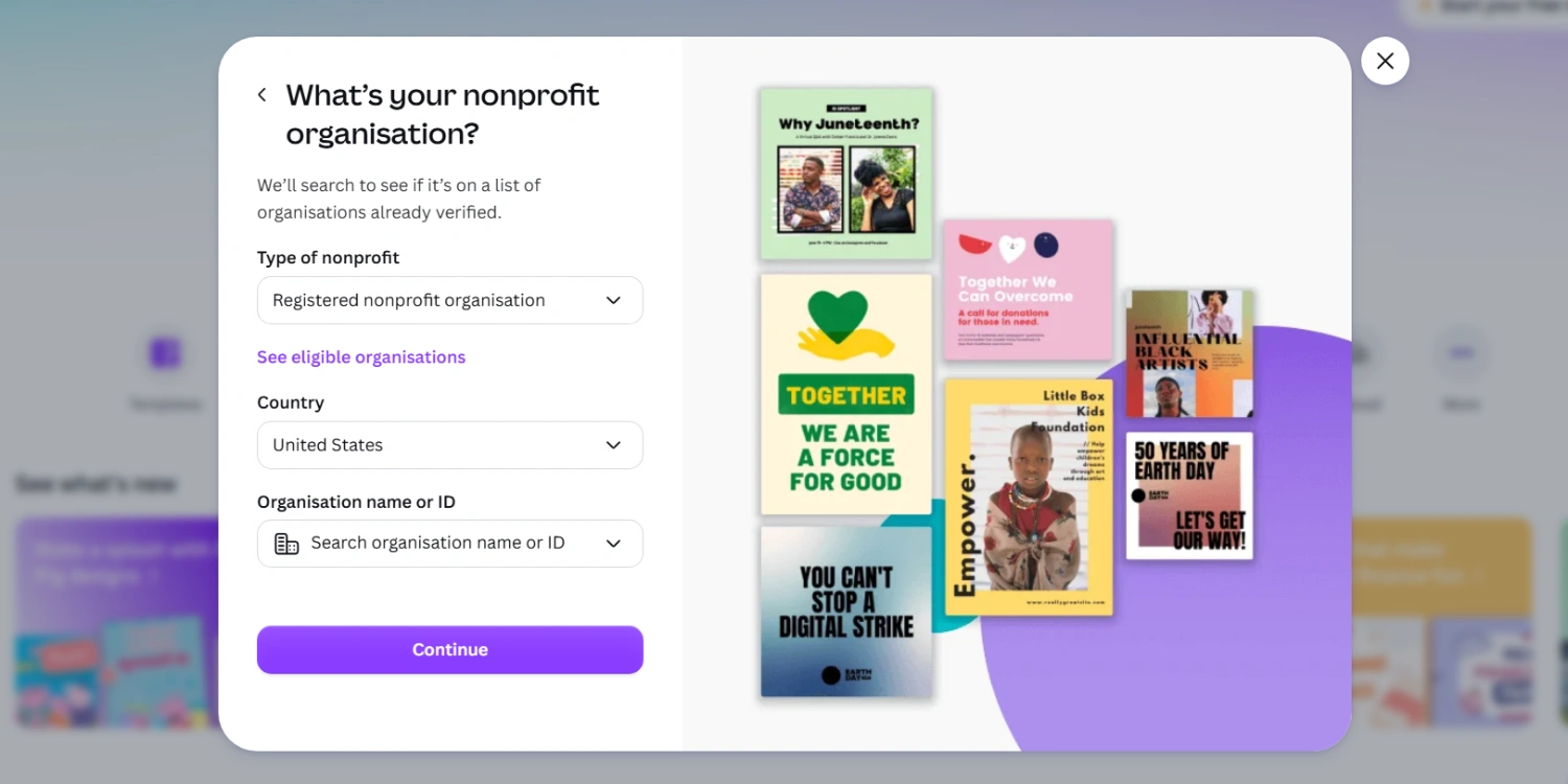
  2. Step 2Go to Canva's nonprofit page and start the application

    Visit canva.com/canva-for-nonprofits and click Apply. If you signed up and selected "nonprofit or charity" as your account type, Canva usually surfaces a direct application link on your homepage for the first 30 days.

  3. Step 3Fill in your organisation details exactly as they appear on your legal documentation

    You'll enter your legal organisation name, size, country, organisation type, and a short mission description. The name on this form has to match your IRS determination letter (or local equivalent) exactly; mismatches are one of the more common reasons applications get held up.

    Canva for Nonprofits application form showing organisation details fields
  4. Step 4Upload your documentation

    For organizations outside the US, Canva may request local documentation confirming nonprofit registration and charitable status. The exact documents required depend on your country and the verification process. Canva uses verification to confirm nonprofit eligibility, and requirements vary by country. Canva currently works with Goodstack for nonprofit verification, so the documentation required can differ depending on where your organization is registered.

  5. Step 5Submit and wait for review

    Approval typically comes back within a few business days once documentation is in order. If you're rejected, Canva allows a reapplication with additional proof, a signed letter of affiliation, a volunteer ID, or similar documentation showing your name, role, and the organisation.

What Do You Get With Canva for Nonprofits?

It's not a stripped-down nonprofit edition. Approved organisations get the same premium tier paying customers use, including:

  • The full premium template and stock photo library, instead of the limited free-tier selection
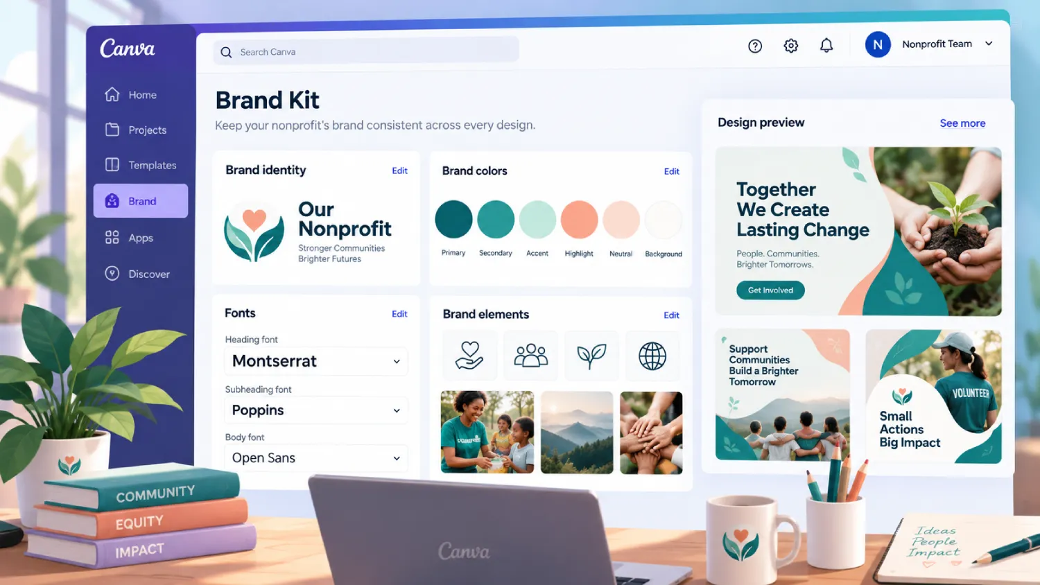
  • Brand Kit tools to lock in your logo, colours, and fonts across every team member's designs
  • Background remover, Magic Resize, and Canva's AI design tools
  • Team folders and shared brand templates, so volunteers and staff aren't rebuilding the same flyer from scratch every campaign
  • Scheduling and direct publishing to social platforms from inside Canva
Canva Brand Kit with a nonprofit's logo, brand colours and fonts

Weak vs. Strong Canva Setups

Example 1 - Brand consistency

Weaker

Every team member designing flyers from whatever template they personally like, in whatever colours look good that day.

Stronger

One Brand Kit set up immediately after approval, with your logo, exact brand colours, and approved fonts locked in for every user on the team.

Why it wins

Inconsistent visuals across social posts, emails, and print materials quietly erode the sense that an organisation is well run. A locked Brand Kit means a volunteer designing an Instagram post automatically pulls the right colours without needing a design brief every time.

Example 2 - Template usage

Weaker

Opening a blank canvas for every new flyer, newsletter, or social post.

Stronger

Building five to six core branded templates once, then duplicating and editing them for every new campaign.

Why it wins

Starting from a blank page is where most of the design time (and most of the inconsistency) creeps in. A locked template turns a 45-minute design task into a 5-minute edit, which matters enormously for a team without a dedicated designer.

Example 3 - Approval workflow

Weaker

Multiple people editing and publishing designs with no review step, so mistakes and off-brand posts go live before anyone catches them.

Stronger

Using Canva's team folders and comment/approval features so one person reviews designs before they're marked ‘ready to publish.’

Why it wins

A typo in a donation-page graphic or a mismatched colour scheme on a fundraising post is a small thing individually, but it adds up to a brand that looks unmanaged. A five-minute review step catches it before donors see it.

12 Templates to Build First

Don't try to build your entire brand library in the first week. Start with these twelve; they cover the situations nonprofits run into constantly, and once they exist as branded templates, every future campaign gets faster.

  1. Social media donation appeal

    A square or vertical post format with a clear headline, a single stat, and a donate link, built once and reused for every campaign.

  2. Instagram Story donation countdown

    A simple template with a progress bar or countdown, since urgency posts consistently outperform static asks.

  3. Volunteer recruitment flyer

    One printable, one digital version, both pointing to the same sign-up link.

  4. Event invitation

    For galas, walks, or community events, with a version formatted for email and one for print.

  5. Thank-you card for donors

    A short, warm template that can go out within 48 hours of a gift instead of weeks later.

  6. Annual report cover and section dividers

    The single design most nonprofits reuse the longest, worth getting right once.

  7. Impact one-pager

    A single page with three or four key numbers, used for board meetings, grant applications, and corporate partner pitches alike.

  8. Email newsletter header

    A consistent banner across every email so your newsletter is recognizable at a glance.

  9. Facebook and LinkedIn cover images

    Updated per campaign, but built from one locked template so the brand stays consistent.

  10. Board or pitch deck template

    For funder meetings and internal presentations, built once with your brand colors and reused every quarter.

  11. Case for support one-pager

    The document a major donor or corporate partner actually reads before deciding to give.

  12. Short-form video template

    A Reels or TikTok-ready template for quick program updates and donor spotlights, since video consistently outperforms static posts for engagement.

Build these as locked templates in a shared team folder, not one-off designs. That's the difference between Canva saving your team real time and Canva just being one more tool nobody has bandwidth to use properly.

Common Mistakes Nonprofits Make With Canva

  • Applying with mismatched documentation. A legal name on the application that doesn't exactly match your IRS letter is one of the most common reasons approval gets delayed.

  • Never setting up a Brand Kit. Skipping this step is why so many nonprofit social accounts look visually inconsistent even after getting Canva Pro.

  • Letting every team member design from scratch. Without shared templates, Canva Pro just becomes a slightly nicer version of the same slow, inconsistent process.

  • Forgetting to add every team member. The free tier covers up to 50 seats, but plenty of approved organisations only add two or three people and leave the rest of the team designing off-brand in whatever free tool they used before.

Want Your Visuals to Actually Reach Donors?

A strong template library only pays off once the right people are seeing it. At Orvador we can help make sure your Canva-built campaigns are reaching search and social audiences.

Get in touch with our team →
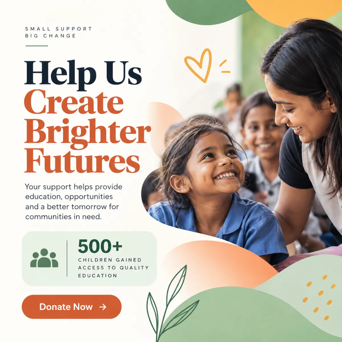
Nonprofit campaign visuals reaching donors through search and social

Getting your visuals right is step one. Turning that consistent brand into donors who actually find you online is the harder part. See how Orvador's NGO digital marketing services help nonprofits turn strong visuals into traffic, and traffic into supporters.

Nonprofit Video Marketing & Storytelling: Low-Budget Videos That Drive Donations

TL;DR: You don’t need a production budget to make video marketing for nonprofits work. A phone, decent light, and a script built around one real person’s story can make your message more engaging without expensive production. This guide covers the four videos every cause needs, a sub-$150 shooting setup, free editing tools, and where to publish so your nonprofit impact storytelling actually reaches donors instead of sitting in a folder. If you want ad-ready cuts, we also cover video ads for nonprofit fundraising campaigns — no agency budget required.

Why Video Matters for Causes

Video Matters for Causes

Text asks people to imagine. Video shows them. That gap matters in fundraising because donors are being asked to understand how their money can create change they may not be able to see directly. A 60-second clip of a real beneficiary, filmed handheld in natural light, can make that impact easier to understand than a paragraph alone.

There’s also a practical reason video marketing for nonprofits works across multiple channels: video can make stories easier to understand, share, and repurpose. Instagram and YouTube are naturally video-led platforms, while useful video content can also support visibility when it is relevant to what people are searching for.

And donors can remember video. A well-made impact clip can make a nonprofit’s work more tangible and help supporters understand what their contribution can accomplish. That’s the case for nonprofit video storytelling in one line: it doesn’t just inform, it can help people connect with the mission while the story is fresh.

None of this requires a videographer on staff. Just a plan, a phone, and a willingness to keep things a little rough around the edges.

The 4 Videos Every Nonprofit Needs (Scripts Included)

Videos Every Nonprofit Needs

Most organizations try to make one video do everything. It rarely works. Build these four instead and reuse them across different campaigns and channels.

1. The 90-Second Founder or Field Story

Script skeleton: state the problem in one line (“Every year, 40 families here lose their harvest to a single flood.”) → cut to the person closest to it explaining what changed → end on a specific ask (“₹500 rebuilds one family’s seed stock.”). Keep it under 90 seconds and focus on one clear story.

2. The Donor Impact Recap

Your thank-you-and-proof video, sent to existing donors quarterly.

Script: “Here’s what your last gift did” → three concrete outcomes with numbers → one beneficiary quote → a soft ask to renew or upgrade.

This gives donors a clear view of what their support helped accomplish and can complement regular donor communications.

3. The 15-Second Social Hook

Built for Reels and Shorts, not repurposed from something longer.

Text overlay poses a question or stat in the first two seconds, cuts to five seconds of raw footage, and ends on your handle and a link-in-bio prompt. Designed to be shared and understood quickly.

4. The Campaign Ask

Tied to a specific push — GivingTuesday campaign ideas, a matching gift window, or a disaster response appeal.

Structure: urgency line → why now → exact dollar-to-outcome ratio → deadline → button.

This is the format behind many video ads for nonprofit fundraising campaigns, built around one trackable conversion.

Write all four scripts before you shoot anything. It’s the difference between an afternoon of filming and three weekends of reshoots.

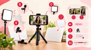
Shooting on a Phone: Gear & Setup Under $150

Shooting on a Phone: Gear & Setup Under $150

You don’t need more than this list, and most of it can be found secondhand.

A tripod or phone clamp (~$10–15) — the biggest quality jump for the least money. Shaky handheld footage can distract viewers; locked-off footage makes the shot feel more intentional.

A clip-on lavalier mic ($15–25) — audio matters more than picture. Viewers may forgive grainy video, but unclear audio can make a clip difficult to follow.

A cheap LED panel or ring light ($20–40) — window light works outdoors, but indoor interviews may need additional light to keep faces clear.

A $5 sheet of white foam board as a reflector — bounces light into shadows, especially useful on harsh midday shoots.

Shoot at 1080p or 4K, horizontal for YouTube and your website, and grab a few vertical takes of the same scene for Reels and Shorts. Film somewhere quiet, ask your subject two or three versions of the same question, and grab 10 extra seconds of silence at the start and end of every clip for breathing room in the edit.

Editing & Captions With Free Tools

Editing & Captions With Free Tools

You don’t need Premiere Pro for any of the four video types.

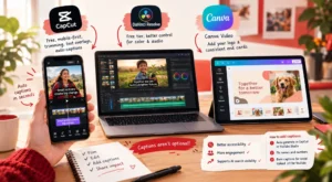
CapCut — free, mobile-first, and useful for trimming, text overlays, and auto-captions. Most social cuts can be built entirely inside the app.

DaVinci Resolve (free tier) — steeper learning curve, but useful for founder-story and campaign-ask videos where color and audio need finer control.

Canva Video — useful for adding your logo and a consistent end card across every video without opening a separate tool.

Also Read: Canva for Nonprofits

Captions aren’t optional. They make videos easier to follow when sound is off and provide additional text context around video content. They can also support AI search visibility when the page and video are relevant to what people are searching for.

Auto-generate captions in CapCut or YouTube Studio, then fix the names and numbers the auto-transcriber mangles. Burn captions into the video for social; upload a clean .srt file to YouTube separately.

Distributing: YouTube SEO, Reels, Ads, Email Embeds

Distributing: YouTube SEO, Reels, Ads, Email Embeds

Filming the video is half of video marketing for nonprofits. Getting it in front of the right person is the other half, and it’s the step most organizations skip.

YouTube SEO

Write a real title and description, not the video’s file name. SEO for nonprofits also depends on making content useful and discoverable rather than relying on keyword repetition.

Include your keyword phrase naturally in the title, add a timestamped description with the cause and outcome, and add an end screen linking to your donation page. A strong opening can also help keep viewers engaged once they start watching.

Reels and Shorts

Post the 15-second hook natively on each platform rather than simply sharing a YouTube link. Native uploads allow you to tailor the format and captions to each platform.

Post consistently rather than in bursts; two Reels a week can give you more opportunities to learn what resonates than posting eight in one week and none for a month.

Video Ads for Nonprofit Fundraising Campaigns

If you have paid social or paid Google Ads budget, your campaign ask video can be useful creative to test. If you’re using Google Ad Grants, use the Grant primarily for eligible Search campaigns rather than video placements.

For a deeper comparison, see Google Ads vs Google Ad Grants.

Keep the first three seconds free of logos or slow build-ups. That’s exactly where mobile viewers may scroll past. Run the 15-second cut for cold audiences and the 90-second story for retargeting warm ones when your campaign setup and audience data support that approach.

Email Embeds

Don’t embed the raw video file. Many email clients don’t reliably support embedded video. Use a thumbnail image with a play-button overlay linking out to YouTube or your site; this gives recipients a clear path to watch the full video.

For more on turning your organization’s proof points into content that converts, see our guide on turning case studies into donor magnets. The same interview process behind that piece feeds a strong founder-story script here.

Ready to Build Your Video Content Plan?

Scripts, gear, and free tools get you started, but a nonprofit marketing plan and real content calendar are what turn one good video into a repeatable donor-acquisition channel.

Get a video content plan in your free strategy call with Orvador, and we’ll map out which of the four video types to shoot first.

Book your free strategy call →

Grant Writing for Nonprofits: Process, Proposal Template & Winning Samples

Most rejected proposals aren’t rejected because the program was weak. They’re rejected because the writing didn’t do the program justice. The need section read generic, the budget didn’t match the narrative, or the outcomes were vague enough that a reviewer had no idea what “success” would actually look like.

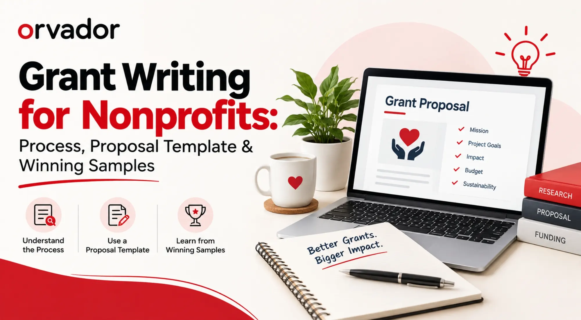
TL;DR: Winning proposals follow a predictable shape – a specific, evidenced need; outcomes a funder can measure; and a budget that lines up with both. This guide breaks down that anatomy, walks through the Need → Outcomes → Budget writing process, gives you a free downloadable nonprofit grant proposal template, and shows three annotated excerpts so you can see what reviewers actually reward. We also cover where AI genuinely helps (and where it flattens your voice), plus how to track applications so nothing falls through the cracks.

If you’re still mapping out where your funding is even coming from, our complete guide to grants for nonprofits covers foundation, corporate, and government channels before you get to the writing stage. This post picks up from there. Once you’ve got a funder and a deadline, here’s how to actually write the thing.

Anatomy of a Winning Grant Proposal

Before you open a blank document, it helps to know what the finished proposal is supposed to look like. Reviewers at most foundations read dozens of applications in a sitting, often against a scoring rubric, and grant writing for nonprofits succeeds or fails on how quickly a reviewer can find the answers they’re scoring for.

A proposal that consistently wins funding tends to include the same core parts, even when the funder’s application portal reshuffles the section names:

  • Executive summary. Two to three sentences a program officer could repeat to their board. What you do, who it serves, and what this grant makes possible.
  • Statement of need. The problem, backed by data specific to your community, not a national statistic that could apply to any city.
  • Goals and outcomes. What changes because this grant existed. Framed as results, not activities.
  • Project description / methodology. How you’ll actually deliver the outcomes – the sequence of activities, timeline, and who’s responsible.
  • Organizational capacity. Why your team, specifically, can pull this off. Past results, staff qualifications, relevant partnerships.
  • Evaluation plan. How you’ll know it worked, and how you’ll report that back to the funder.
  • Budget and budget narrative. Line items that map directly to the activities you just described.
  • Sustainability. What happens after this specific grant runs out.

Notice what’s missing from that list: filler. Reviewers reward proposals where every paragraph earns its place. If a sentence doesn’t move the reader from “interesting cause” to “fundable, specific plan,” it’s a candidate for the cutting room floor.

Step-by-Step Writing Process (Need → Outcomes → Budget)

Most writers get stuck because they try to write top to bottom, in the order the application asks for it. That’s backwards. The strongest proposals are built in this sequence, then reordered to fit the funder’s template at the end.

Step 1: Nail the statement of need first

Everything else in the proposal has to serve the need you establish here, so get specific before you write a single other section.

  • Use local data, not national averages. “1 in 4 children in [your service area] lacks reliable access to X” beats a national CDC stat every time.
  • Cite your source inline or in a footnote. Funders check.
  • Frame the need from the community’s perspective, not your organization’s. It’s their problem your program solves, not your program’s gap in funding.
  • Keep it to one tight paragraph or two. A need section that runs a full page usually means it isn’t specific enough yet.

Step 2: Define outcomes before you touch activities

This is the step most nonprofit writers skip, and it’s the one that separates a strong application from a middling one. Don’t start with “we will run 12 workshops.” Start with what changes because those workshops happened.

  • Write outcomes as measurable statements: “80% of participants will demonstrate improved X by month 6,” not “participants will benefit from the program.”
  • Separate outputs (what you do – workshops held, meals served) from outcomes (what changes – skills gained, food security improved). Funders fund outcomes; outputs are just the evidence you’re on track.
  • Pressure-test each outcome by asking: could we actually measure this with the tools we have? If not, either scale it back or add a data-collection line item to the budget.

Step 3: Build the budget to match the story, not the other way around

The budget is where reviewers check whether your narrative is real. A mismatch here, say, a proposal that promises a full-time coordinator but budgets for ten hours a week is one of the fastest ways to lose credibility.

  • Every activity in your project description should trace to a line item. If it’s in the narrative, it should cost something (or you should explain why it’s in-kind).
  • Separate personnel, direct program costs, and indirect/overhead, and check the funder’s cap on indirect costs before you submit.
  • Include matching funds or other committed revenue if you have them. It signals the project doesn’t live or die on this one grant.
  • Round realistically. Suspiciously round numbers ($10,000 exactly for everything) read as estimated rather than budgeted.

Write the budget narrative last, once the numbers are locked, so it can explain the “why” behind each figure instead of just restating it.

Free Proposal Template (Downloadable)

To save you from rebuilding this structure from scratch every time a new RFP lands, we’ve put together a nonprofit grant proposal template that maps directly to the anatomy above – need, outcomes, methodology, capacity, evaluation, budget, and sustainability, each with prompts for what to fill in and roughly how long each section should run.

[Download the free nonprofit grant proposal template →]

A few ways teams on our client roster use it:

  • As a first-draft skeleton for every new application, so the structure never has to be rebuilt from zero.
  • As an internal boilerplate library. The organizational capacity and evaluation sections change the least between funders, so once they’re strong, they’re mostly reusable.
  • As a review checklist before submission, to catch missing sections before a funder does.

3 Annotated Sample Excerpts: What Reviewers Reward

Reading about proposal structure only gets you so far. It helps to see what a strong paragraph actually looks like next to a weak one. Below are three anonymized, lightly adapted excerpts pulled from real proposal patterns, annotated to show exactly why the stronger version works. These aren’t full samples of grant proposals for nonprofit organizations to copy wholesale. Funder requirements vary too much for that, but the underlying moves transfer across almost any application.

Excerpt 1 – Statement of Need

Weaker version: “Many children in our community struggle with reading. Literacy is essential for future success, and our organization is committed to helping.”

Stronger version: “62% of third-graders in [district] read below grade level, compared to a state average of 34% (State Department of Education, 2026). Without intervention by third grade, students are four times less likely to graduate high school on time.”

Why it wins: The stronger version names a specific place, cites a source, and connects the problem to a consequence the funder cares about. It gives the reviewer a number to hold onto. Something they can reference back to when scoring or when advocating for your proposal in a committee meeting.

Excerpt 2 – Outcomes Statement

Weaker version: “Participants will gain valuable skills through our job training program and be better prepared for employment.”

Stronger version: “75% of program graduates will secure employment within 90 days of program completion, and 60% will retain that employment at the six-month mark, tracked through employer verification and participant follow-up calls.”

Why it wins: It’s measurable, time-bound, and tells the reviewer exactly how you’ll know if it worked, which also previews that your evaluation plan is already thought through, not bolted on later.

Excerpt 3 – Organizational Capacity

Weaker version: “Our organization has years of experience serving the community and a dedicated, passionate staff.”

Stronger version: “Over the past four years, our team has delivered this program to 1,200 participants across three counties, maintaining an 85% completion rate – 20 points above the state average for similar programs. Our program director has led workforce initiatives for over a decade, including two prior grants from [comparable funder].”

Why it wins: Specific numbers and a named track record do the work that adjectives like “passionate” and “dedicated” can’t. Reviewers aren’t scoring your enthusiasm; they’re scoring your evidence.

The pattern across all three: specificity beats sentiment, every single time.

Using AI to Draft Faster (Without Sounding Generic)

AI tools have genuinely changed how fast a first draft comes together, but the nonprofits winning more grants aren’t the ones handing the whole proposal to a chatbot. They’re the ones using AI for the parts that don’t need a human voice and reserving their own judgment for the parts that do.

Where it helps:

  • Turning a bulleted outline into a first-draft paragraph you can then edit for voice.
  • Rewriting a section to fit a different funder’s word count without starting over.
  • Checking a draft against a funder’s stated priorities to flag gaps before you submit.
  • Drafting boilerplate, organizational history, staff bios, that changes rarely between applications.

Where it tends to backfire: statements of need and outcomes sections written entirely by AI often read the same way every other nonprofit’s AI-drafted section reads – competent, but generic, and missing the local data and specific numbers that actually persuade a reviewer. The fix isn’t avoiding AI; it’s feeding it your own data and editing hard for specificity before you submit.

We’ve written a more detailed walkthrough of this exact workflow in how to leverage generative AI to write grant proposals that win, including prompt structures and a review checklist for catching AI-flattened language before a funder does.

Tracking Applications & Following Up

A strong proposal can still lose if it’s tracked poorly – missed deadlines, duplicate outreach to the same program officer, or no record of what a funder asked for last cycle all cost nonprofits funding that had nothing to do with the writing itself.

A workable tracking system doesn’t need to be complicated. At minimum, track:

  • Funder name, program officer, and their stated priorities or focus areas
  • Deadline (and whether it’s a rolling, LOI, or full-proposal deadline)
  • Amount requested and amount awarded (once known)
  • Reporting deadlines if funded
  • Notes from any prior submission – what a reviewer flagged, what got funded, what didn’t

A shared spreadsheet or a lightweight CRM both work; what matters is that the whole team can see it, not just the one person who wrote the last application. After submission, a short thank-you note to the program officer, even before a decision, keeps the relationship warm. If you’re declined, a brief, genuine request for feedback often gets a useful answer and sets up a stronger resubmission next cycle.

Ready to stop rebuilding your proposal structure from scratch every cycle? Download the free nonprofit grant proposal template to get started, or if funding is just one piece of a bigger digital growth puzzle, see how Orvador’s nonprofit digital marketing support helps NGOs build the online presence and data infrastructure that make every grant application stronger.

15 Best Nonprofit Websites of 2026 (And Exactly Why They Work)

TL;DR: We reviewed 15 of the best nonprofit websites live right now and scored each one on design, donation UX, storytelling, SEO and speed. The short version: the nonprofit websites that convert best aren’t the flashiest; they’re the ones that get a first-time visitor to a donation form or a program page in under three clicks. Below are the actual nonprofit website examples, what each one gets right, and the patterns you can steal for your own site this week.

Most “best nonprofit websites” roundups are just screenshots with a caption. We wanted something more useful for the people who actually have to brief a developer or fight for donation-page changes. So we picked 15 sites across different cause areas – water, education, environment, animal welfare, global health, journalism, and pulled apart what’s actually working on each one, not just what looks nice in a thumbnail.

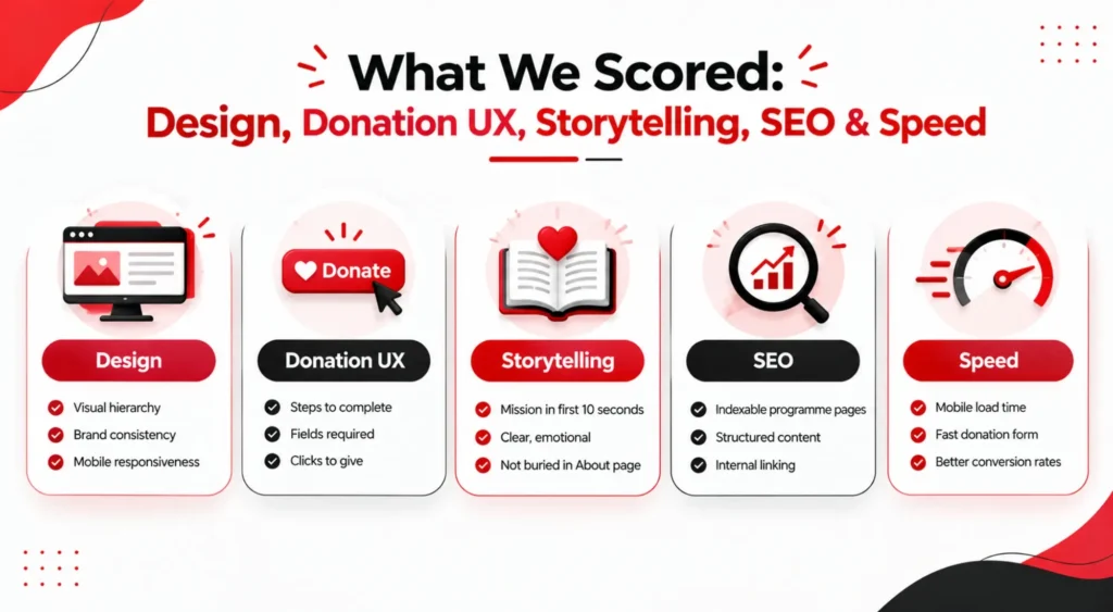
What We Scored: Design, Donation UX, Storytelling, SEO & Speed

What We Scored

We didn’t rank these purely on visual polish. Each site was reviewed against five criteria that map to what a nonprofit website is actually supposed to do:

  • Design – visual hierarchy, brand consistency, mobile responsiveness
  • Donation UX – how many steps, fields and clicks stand between a visitor and a completed gift
  • Storytelling – whether the mission comes through in the first ten seconds, not buried in an About page
  • SEO – whether the site is built to be found (indexable programme pages, structured content, internal linking) rather than just look good once someone lands on it
  • Speed – load time on mobile, since a slow donation form is a lost donation

A site could be beautiful and still score low here if the donate button takes four clicks to find. That’s the gap most “best nonprofit websites” lists skip. They’re judging brochures, not conversion tools.

Websites #1–15: Nonprofit Website Examples With Teardown Notes

Charity: water homepage screenshot
★ Top Pick

Charity: water

Best Use of Transparency as Donation UX

The clean-water nonprofit built its entire model around one number: 100% of public donations fund water projects. That promise sits near the top of the homepage, and individual project pages let donors see exactly where their money went.

Why it ranks #1

It's one of the clearest examples of transparency doing the donation-UX work for you — the trust argument is built into the page structure, not stated once and forgotten.

TakeawayShow donors exactly where a specific gift went, not just an aggregate impact stat.

Girls Who Code homepage screenshot

02Girls Who CodeBest Audience-Split Navigation

Bold, high-contrast color blocking and a chapter finder that gets a parent or teacher to a local programme in one search. The CTAs are split by audience (join, donate, partner) instead of forcing everyone through the same funnel.

TakeawayA small fix a lot of nonprofit websites skip: separate CTAs for separate audiences.

The Ocean Cleanup homepage screenshot

03The Ocean CleanupBest Data-Driven Credibility

More engineering firm than typical charity site, and that's the point. Real-time counters and data visualisations of plastic removed build credibility for a technical mission where "trust us" isn't enough on its own.

TakeawayFor technical missions, live data can carry more trust than testimonials.

World Wildlife Fund homepage screenshot

04World Wildlife FundBest Homepage Donation Placement

A split-screen homepage puts the donation form directly beside the hero image instead of behind a separate click. Symbolic species adoptions turn a one-time gift into a gift-shop-style purchase decision.

TakeawayA clever reframe for cold traffic: sell the gift, not just the cause.

Malala Fund homepage screenshot

05Malala FundBest Minimalist Advocacy Site

Minimal navigation, one dominant donate CTA, and advocate storytelling that leads with real names and photos rather than statistics.

TakeawayProof that a nonprofit website doesn't need dozens of menu items to feel complete.

DonorsChoose homepage screenshot

06DonorsChooseBest Project-Marketplace Model

Instead of donating to an abstract cause, visitors fund a specific classroom project with a live progress bar.

TakeawayOne of the more copyable ideas here for any nonprofit with discrete, fundable initiatives.

St. Jude Children's Research Hospital homepage screenshot

07St. Jude Children's Research HospitalBest Default-to-Monthly Giving

Patient stories carry the emotional weight, but the site backs them with hard research statistics and a blunt promise: no family pays. Monthly giving is the default option on the donate page, not an afterthought.

TakeawayMake recurring giving the default choice, not a secondary toggle.

Feeding America homepage screenshot

08Feeding AmericaBest Concrete-Impact Framing

A ZIP-code food bank locator sits above the fold, alongside a donation calculator that shows "$1 = 10 meals."

TakeawayTurning a vague ask into a concrete number is one of the simplest, most underused tactics among nonprofit websites.

ASPCA homepage screenshot

09ASPCABest Recurring-Membership Primary CTA

Photography does the heavy lifting here, but the real strength is the recurring "Guardian" membership programme, positioned as the primary ask instead of a secondary option buried under one-time giving.

TakeawayLead with the recurring ask when it's your strongest offer, not just your default one.

Mennonite Central Committee homepage screenshot

10Mennonite Central CommitteeBest Information Architecture for Scale

A genuinely hard information-architecture problem — relief and development work spanning dozens of countries — solved with faceted search and clean cross-border navigation for its US and Canada audiences.

TakeawayFaceted search beats a giant flat menu once a nonprofit's programmes span many regions.

Room to Read homepage screenshot

11Room to ReadBest Specificity Over Generic Copy

Country-level impact breakdowns let donors see exactly where a literacy or girls'-education gift lands, geographically and programmatically.

TakeawayA good example of specificity beating generic "help us" copy.

Khan Academy homepage screenshot

12Khan AcademyBest Service-First, Not Fundraising-First

The donate ask is deliberately quiet. Free access to learning is the headline; giving is framed as protecting that access rather than the primary CTA.

TakeawayWorth studying if your mission is service-first, not fundraising-first.

ProPublica homepage screenshot

13ProPublicaBest Separation of Ask and Content

A membership-and-donation strip runs separately from editorial content, so the ask never interrupts the journalism. Full transparency about funding sources reinforces the nonprofit-newsroom trust proposition.

TakeawayKeep the fundraising ask visible but out of the way of the core content experience.

Giving Kitchen homepage screenshot

14Giving KitchenBest Dual-Audience Design

A narrow, sector-specific mission (crisis relief for restaurant workers) gets a website that speaks directly to two very different audiences — people applying for help and people funding it — without either path feeling like an afterthought.

TakeawayWhen a mission serves two very different audiences, give each its own clear path in.

Bill & Melinda Gates Foundation homepage screenshot

15Bill & Melinda Gates FoundationBest Funder-Not-Fundraiser Model

Structured more like a magazine than a fundraising site, because it's a funder, not a fundraiser.

TakeawayNot every nonprofit website needs a prominent donate button — forcing one on when it doesn't fit the model can actually hurt credibility.

Patterns the Best Nonprofit Sites Share

Across all 15 nonprofit website examples, a handful of habits show up again and again:

  • The donation ask is specific, not vague. “$1 = 10 meals” beats “please give” every time.
  • Storytelling leads with people, not statistics. The stats show up as backup, not the opener.
  • Monthly giving is the default, not the alternative. The sites with the strongest recurring-donor programmes make it the pre-selected option on the form.
  • Navigation is split by intent. Donors, volunteers and beneficiaries rarely need the same three clicks. The better sites don’t force them through one path.
  • SEO isn’t an afterthought. Programme and cause pages are built to be indexed and found, not just to look good once traffic already exists. We go deeper on this in our guide to SEO for nonprofits, if that side of things isn’t in place yet.

Quick Wins You Can Copy This Week

You don’t need a full redesign to borrow from this list. A few of these changes take an afternoon:

  1. Quantify your donation impact. Replace “your gift helps” with a specific number tied to a specific outcome.
  2. Move monthly giving to the default toggle on your donation form instead of a secondary link.
  3. Cut your donate form down to essential fields. Every extra field is a reason to abandon.
  4. Add a locator or filter if your programmes are geography- or category-specific. Visitors shouldn’t have to scroll a full list to find what applies to them.
  5. Separate your CTAs by audience on the homepage instead of sending everyone to the same button.
  6. Use the best nonprofit tools to streamline tasks such as SEO checks, page-speed monitoring, content optimization, and donation-form analysis.

If your site’s core structure needs more than a quick fix, our breakdown on nonprofit website design covers the bigger issues – donation UX, page speed, and the fixes that actually move the needle before you lose more donors.

Want Your Site on This List Next Year?

Most of the sites above didn’t get here by accident – someone audited the donation flow, fixed the information architecture, and rebuilt pages around what actually converts. If you want the same eye to run over your own site, get in touch with our team for a free nonprofit website audit.